
F1 Rebranding
For the 2026 Formula One season, we redesigned everything to make it look... unique
Sector
Sports
Entertainment
After a rough season for me as a Ferrari fan, we decided that the new 2026 rules needed to come with a package of new visual. We recrafted from scratch all of the F1 Assets, from simple pilot presentation, to lower third, radio, leaderboard... and all, in only three days !
Art Direction, UI & Broadcast Package Design, Motion Design
Nowadays, Formula One has encountered a huge popularity gain. If in the past, F1 was a sport that was historically niche, it went viral and democratized itself a lot through the past years, especially thanks to the different programs that put the light on this sport.
Thinking Process

What it means
So as F1 grew popular, it became a real pop culture object. Still, its visual universe stayed really mechanical and niche. To rethink this artistic universe and to turn it into a more approachable and contemporary and mostly, more lifestyle and appealing to newcomers; was, for us, the key issue of this work. By embracing the technical imaginary, and transforming it to something more desirable, emotional, and nearly "mode"; while keeping its mechanical roots.
So,
We created a new visual language for the next season...
Between tradition, and modernity... I guess
Keeping a similar type of logo, while creating a masterclass with what we have
Logotype

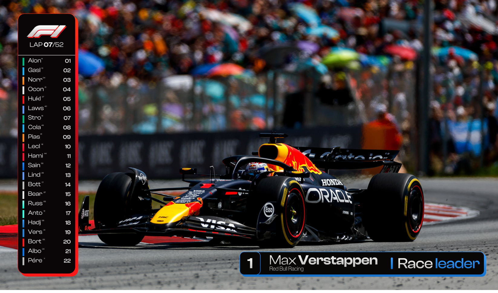
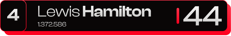
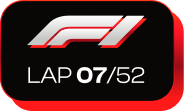
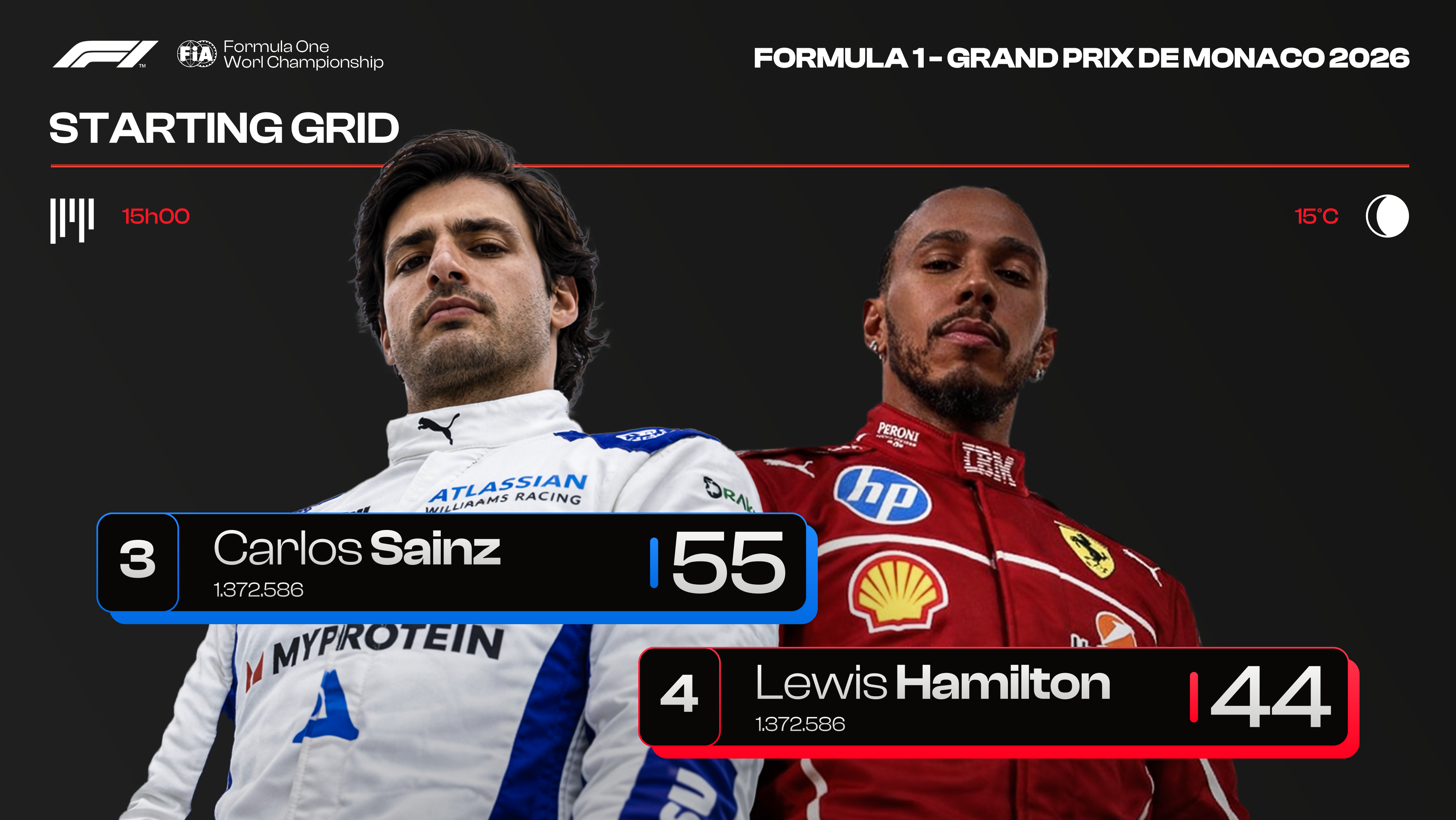
Race day
We keep the logo almost the same, but we double it with a layer that add some presence to it, and make it more impactful.

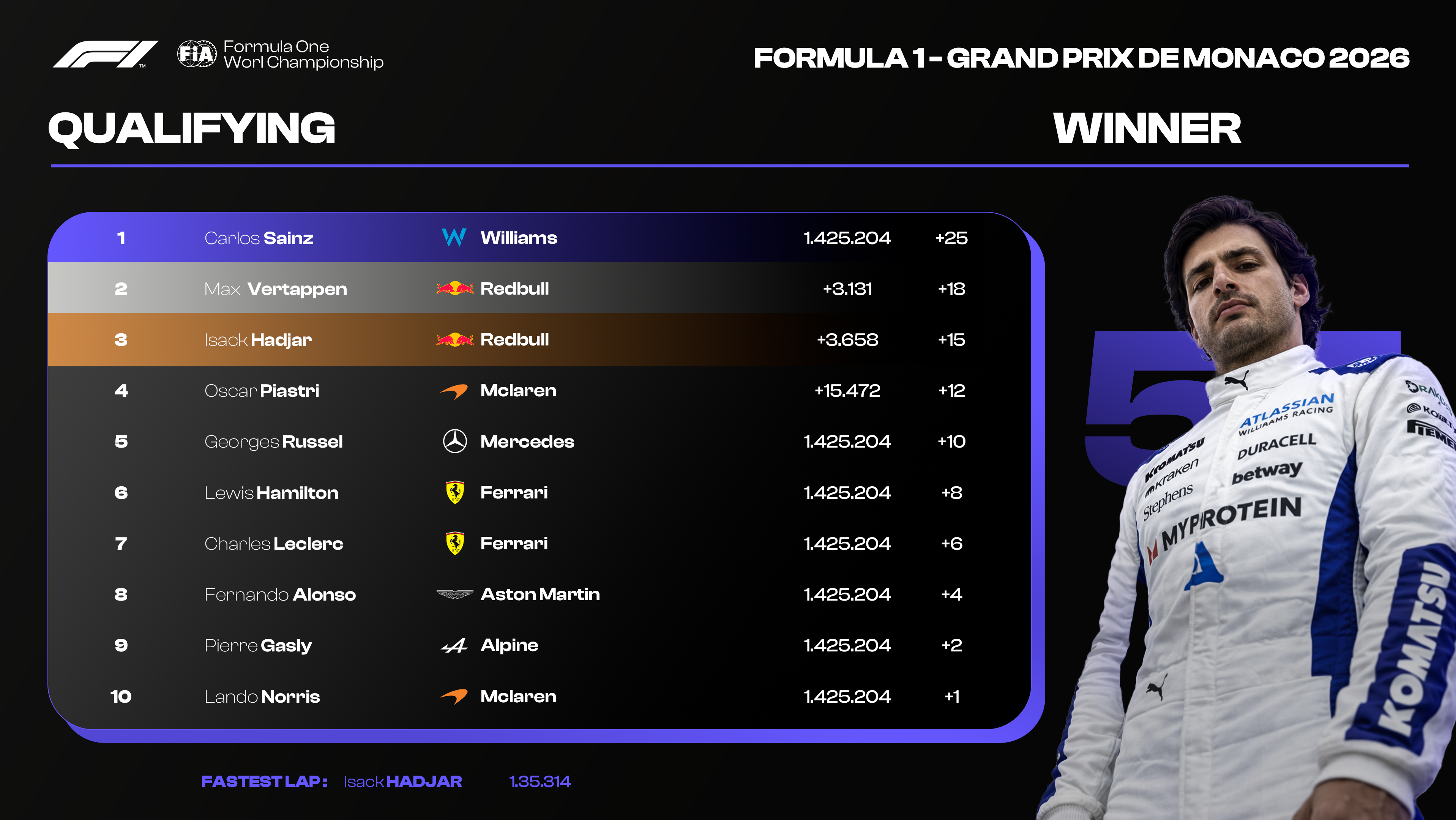
Qualification day
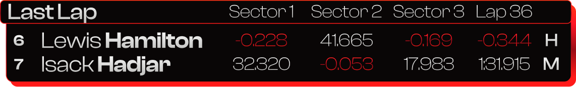
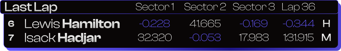
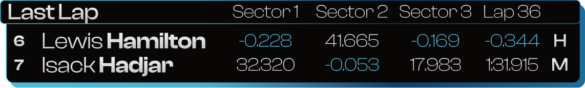
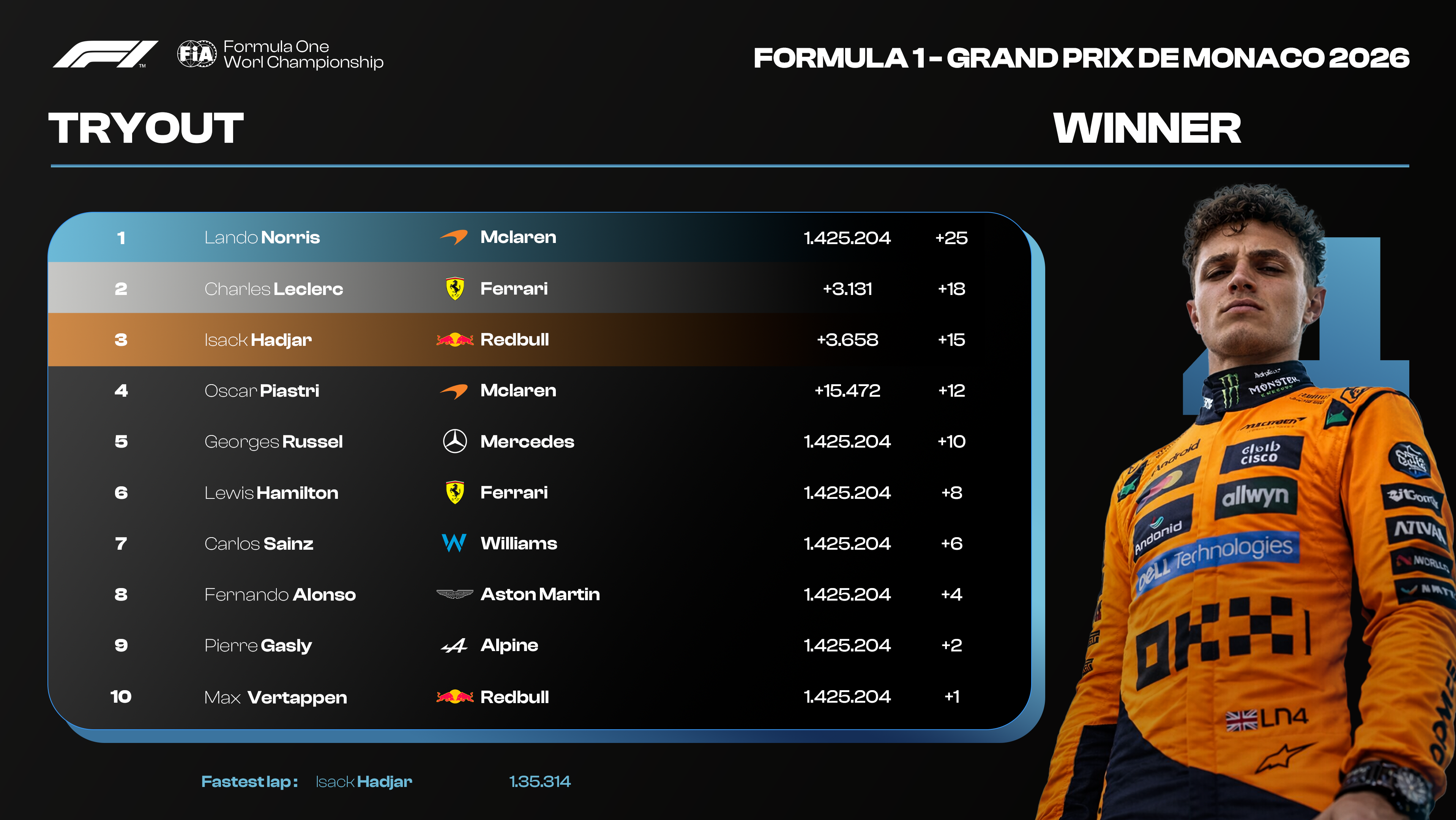
For each day, we have designed a brand new color, in order to make it look simple if you're watching F1 for the first time.

Tryout day
We've kept a strong red for race day, we chose a purple for qualifying, and a light blue for tryout, in order to create a complementary palette
Coooolors
Keeping a similar type of logo, while creating a masterclass with what we have
Color Palette
WHY ?
We mostly use gradients rather than colors, in order to express movement and texture. It's also really efficient in sport in general.
BUUUTT
We want the whole visual to be very instinctive and visual, so we want our assets to take different colors to match the situation. So we developed a design system that uses mostly the colors right above, but also, some very precise color/gradient that will take cover few assets, based on situation, F1 team....
Coooolors System
How do we use these colors we just created basically
Typeface
How do we use these colors we just created basically
A Typeface Built for Speed
Sharp, geometric, and unapologetically modern
Clash Display brings a precision-engineered feel to every headline. Its clean geometric structure draws from Swiss rationalism, adapted for a generation that consumes sport as spectacle. Used across all editorial titles, lower thirds, and display elements, it gives the F1 rebrand its signature edge — technical without being cold.
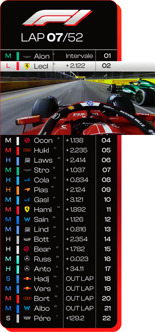
Charles Leclerc insane overtake
One of the 10 best Overtake in F1 history
Charles Leclerc drove like crazy and went for a record lap in about 21 seconds in the Spa-Francorchamps track. Probably the most insane moment in Formula One Since Ayrton Senna drove full speed, and on purpose, into Alain Prost. He did this whole thing, while listening to "You Belong With Me" from Taylor Swift, blasting full volume in his car
Display
Now officially going to the fun part
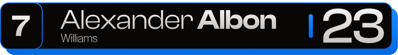
Lower Third


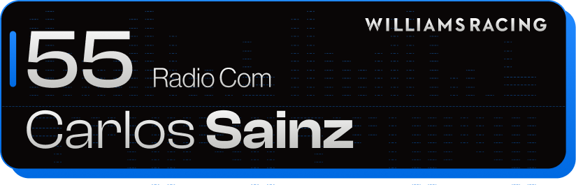
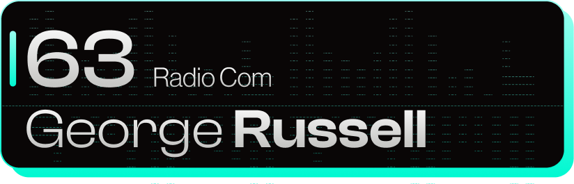
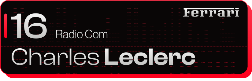
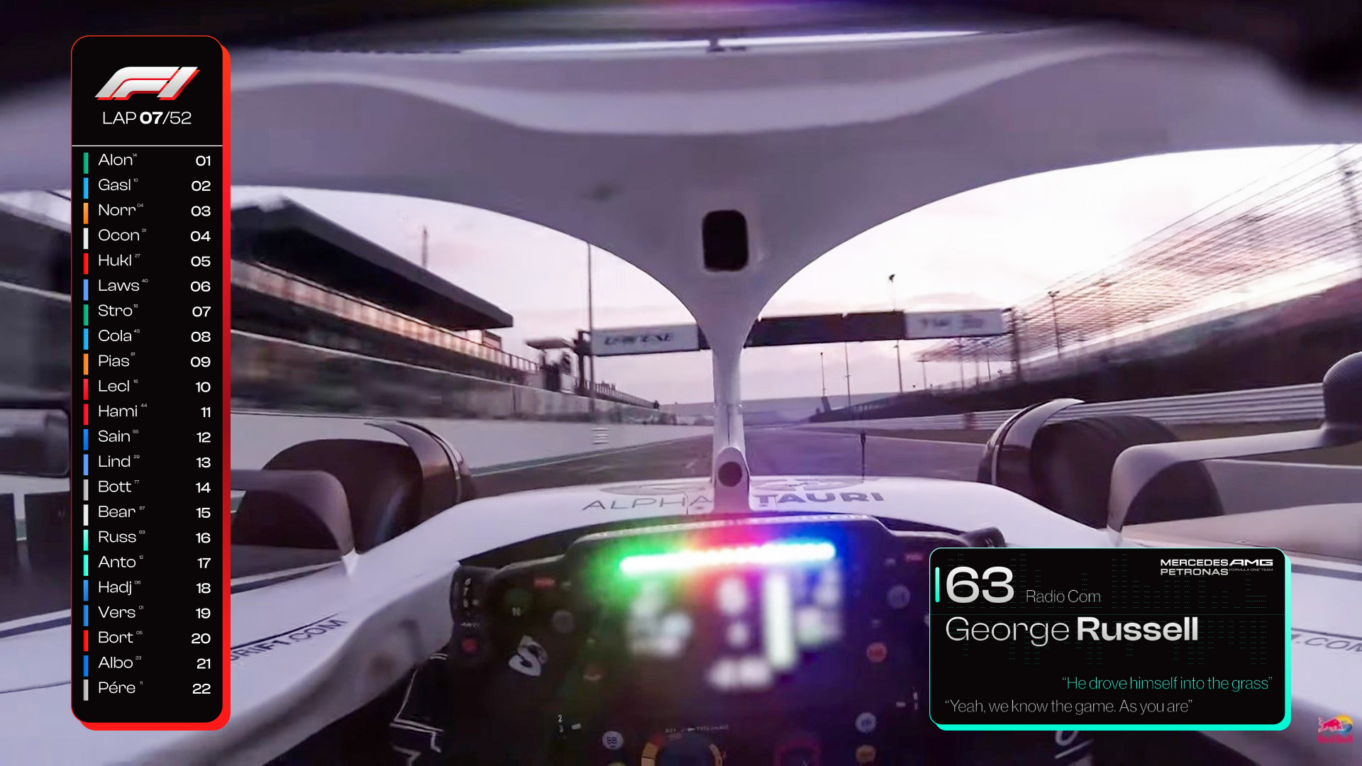
Radio comm
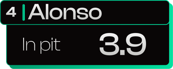
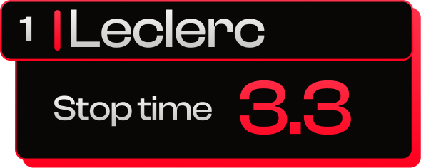
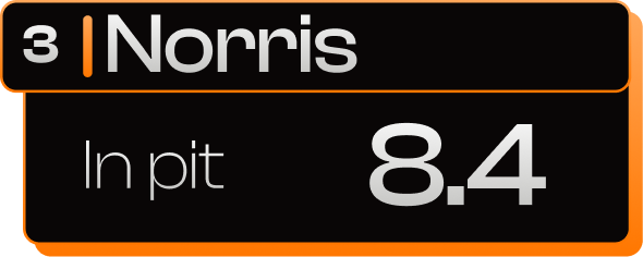
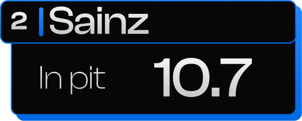
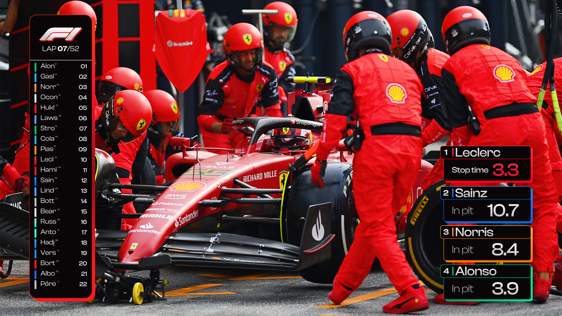
Pit Time
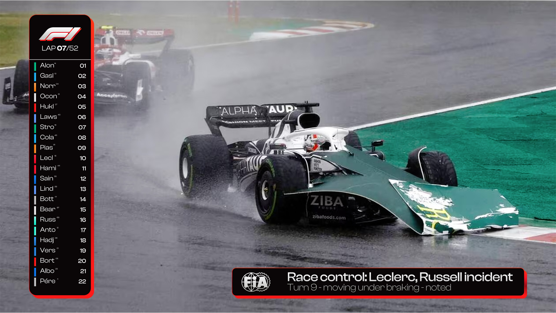
FIA Notification


Race Facts


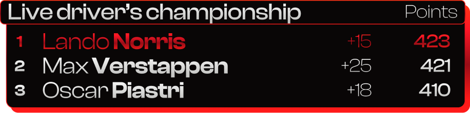
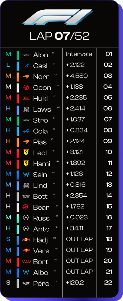
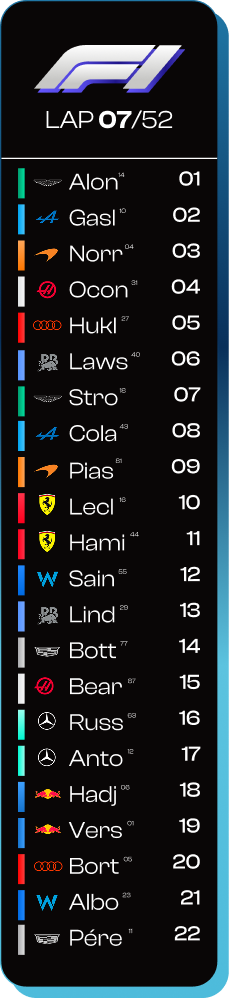
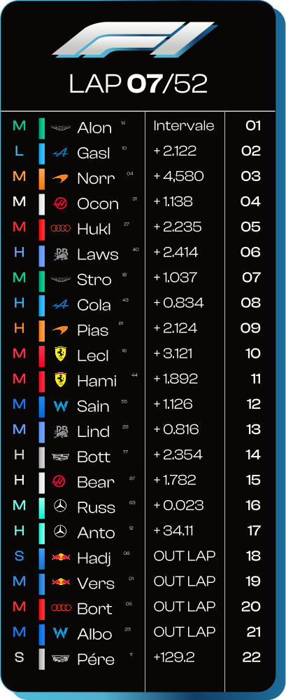
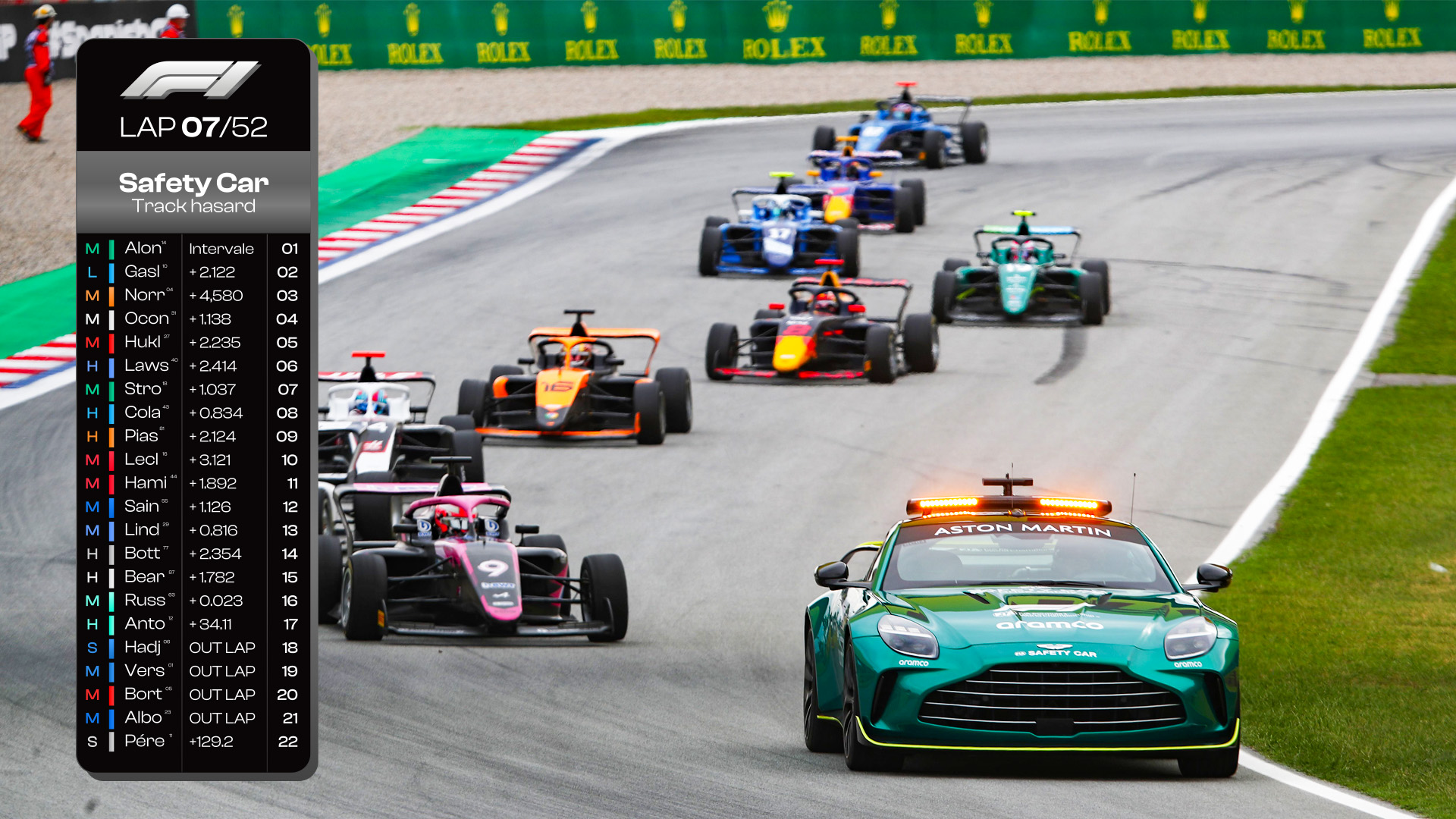
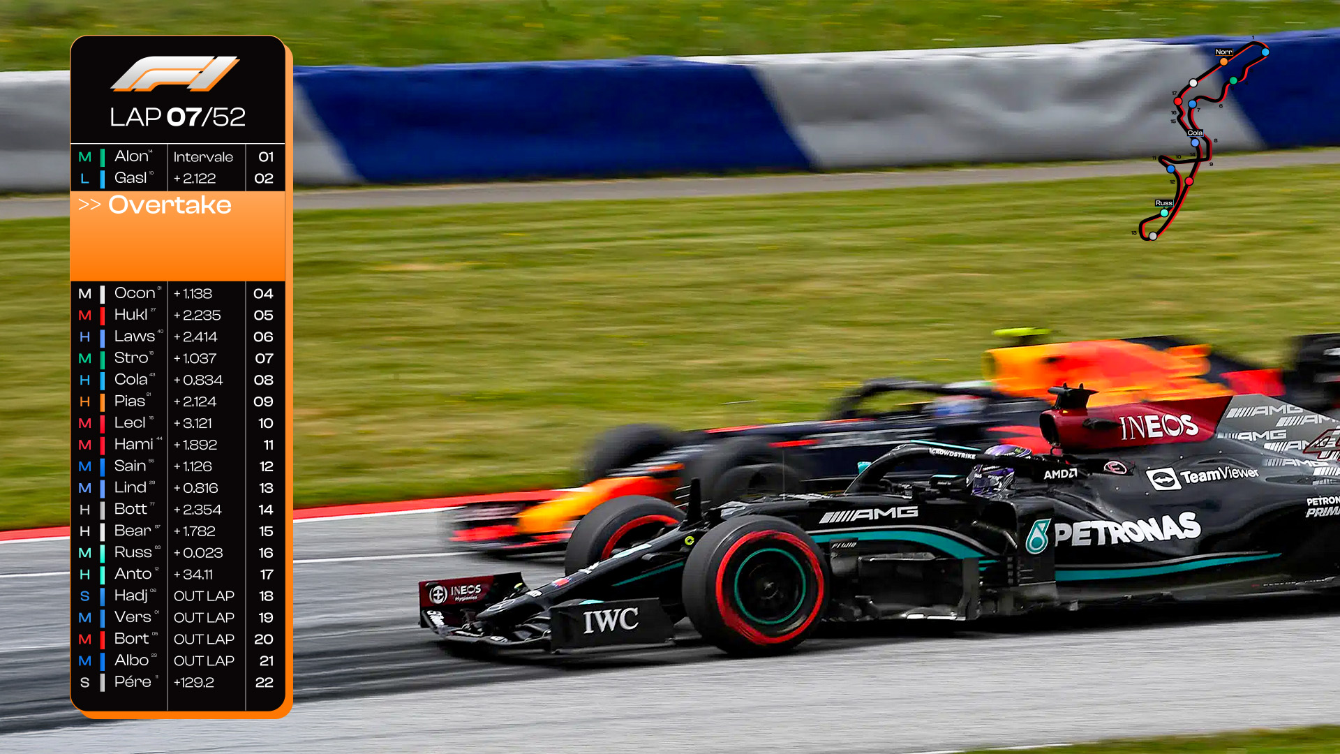
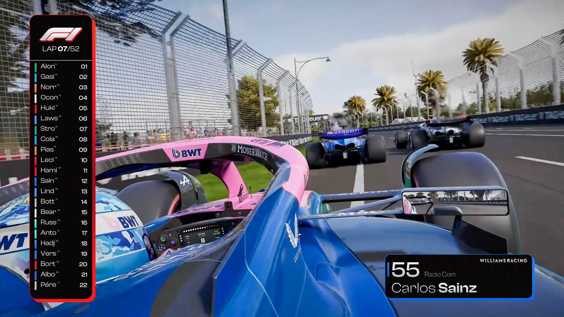
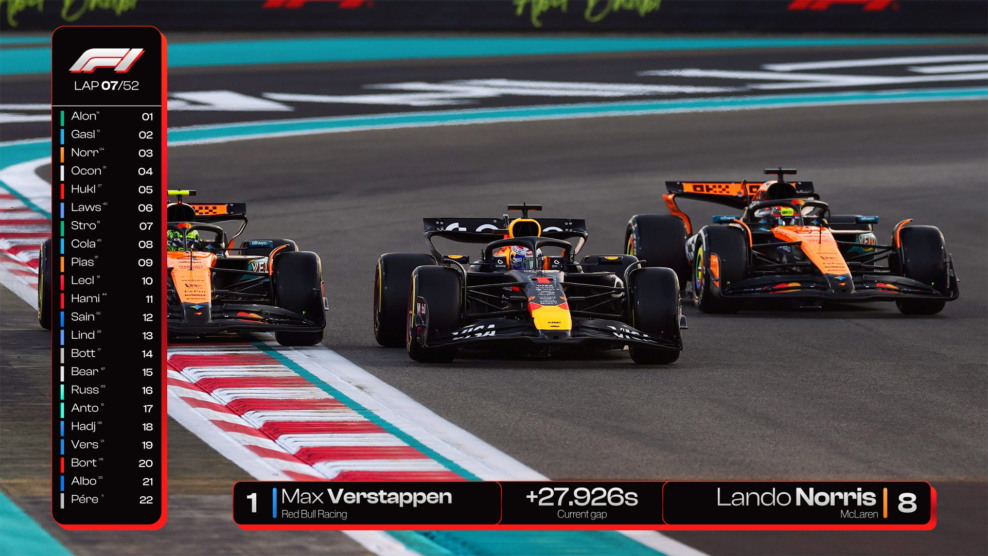
Leaderboard
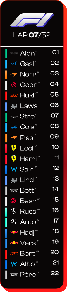
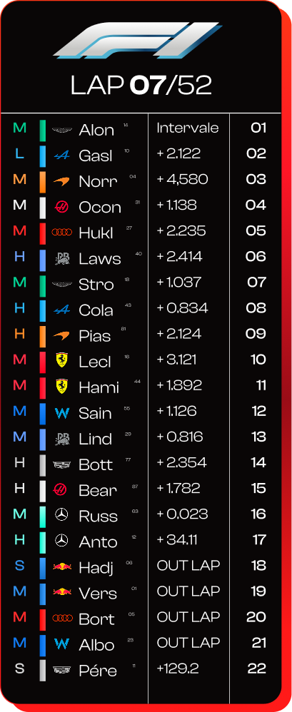
> On raceday
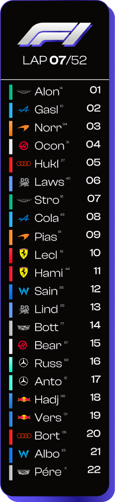
> On Qualification
> On Tryout
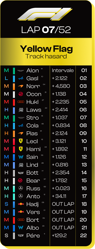
> Yellow Flag
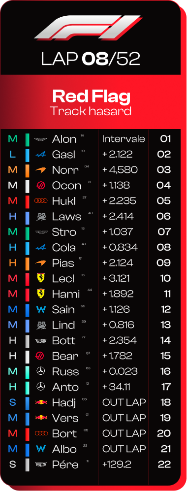
> Red Flag
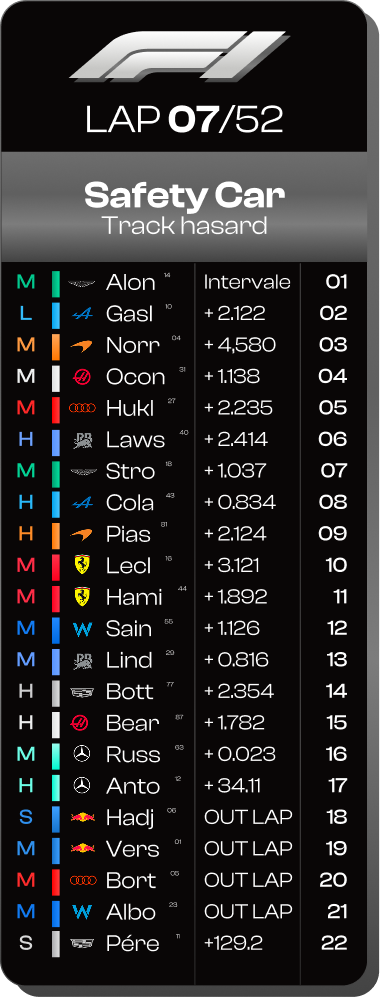
> Safety Car
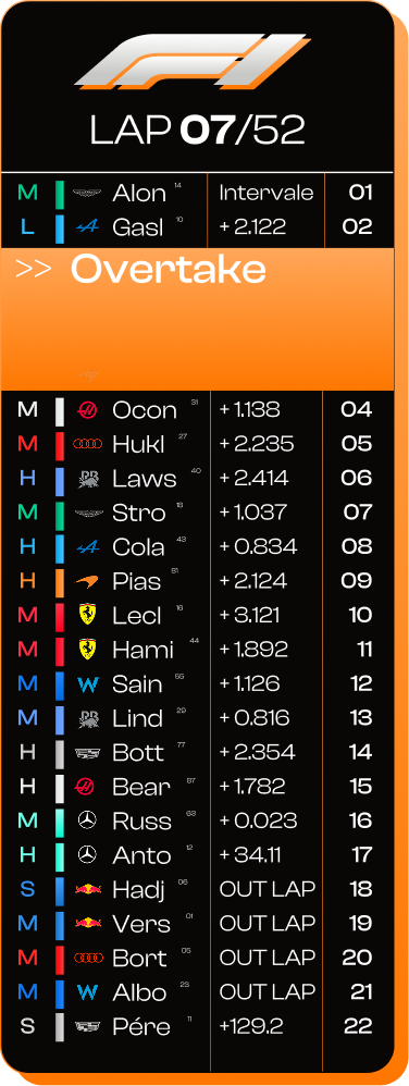
> McLaren Overtake
> Out of range Overtake
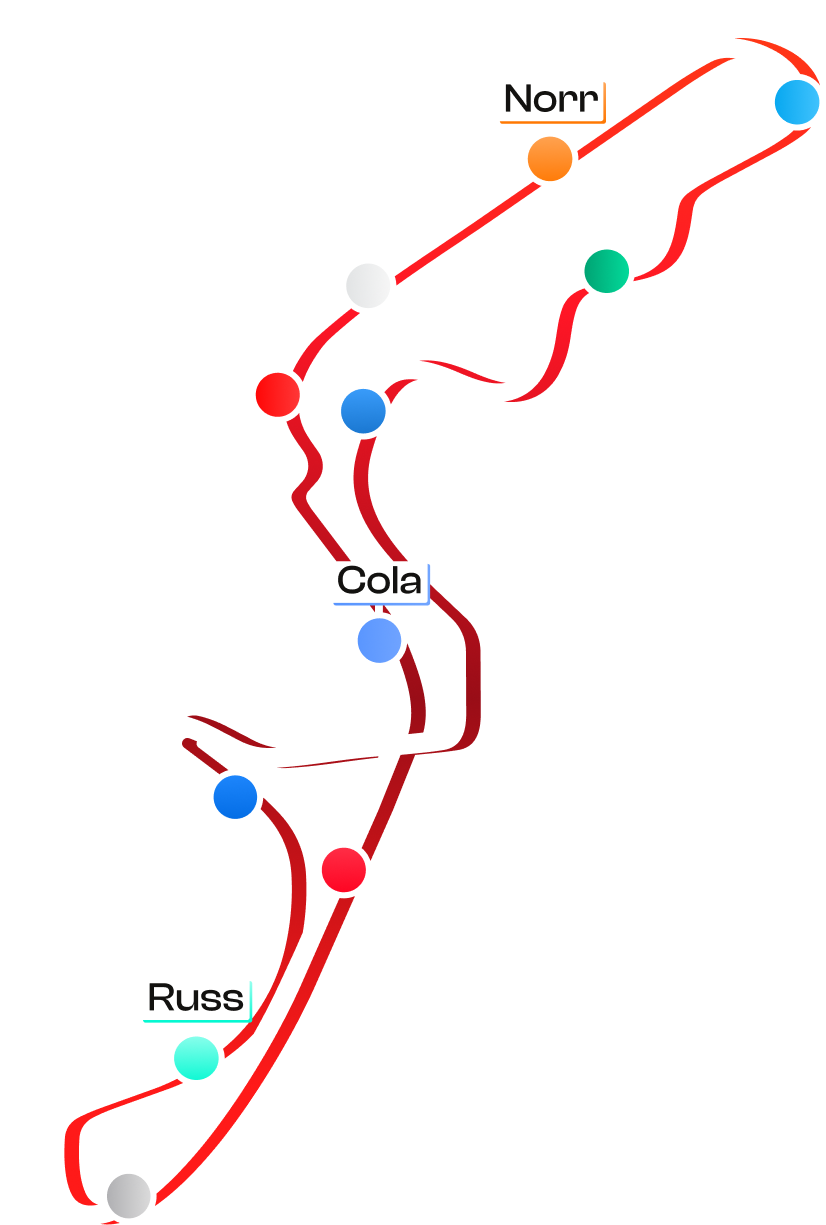
Map
Screen
Fiche Pilote
Transition
Mockups
MOCKUP
This project was made in collaboration with Maxence Aubert and Mathis Couvillers in only three days. Go see their work !